
Josh Martin
Content Creator

Creating a well-structured and intuitive homepage for your Confluence space is essential for ensuring your audience can quickly and easily find the information they need. A cluttered or disorganized space can deter users and reduce the effectiveness of your content. Even worse, a wall of text page will send them clicking close on their tab in a heartbeat. In this post, we’ll walk you through the steps to build a homepage that makes navigating your Confluence space a breeze.
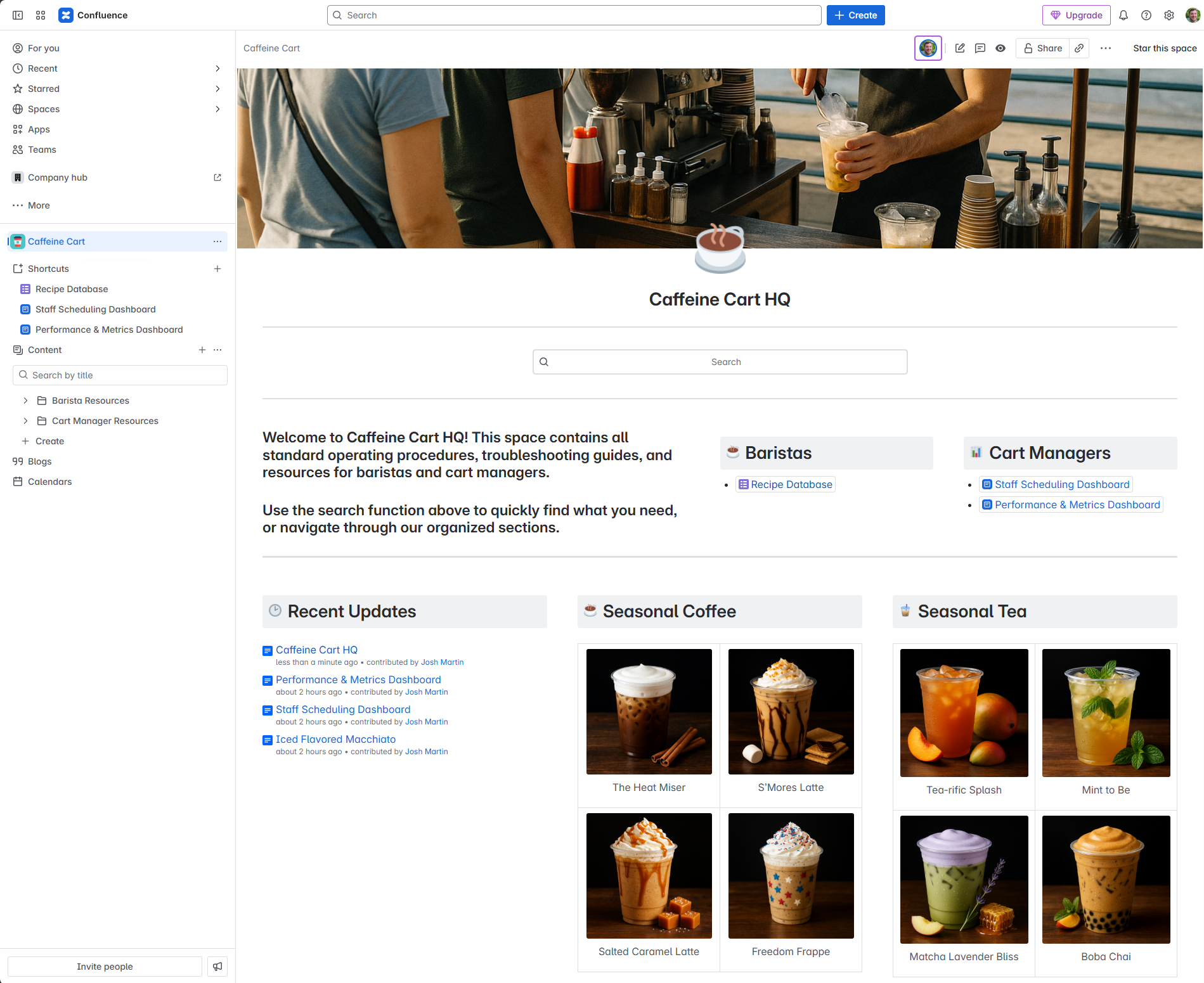
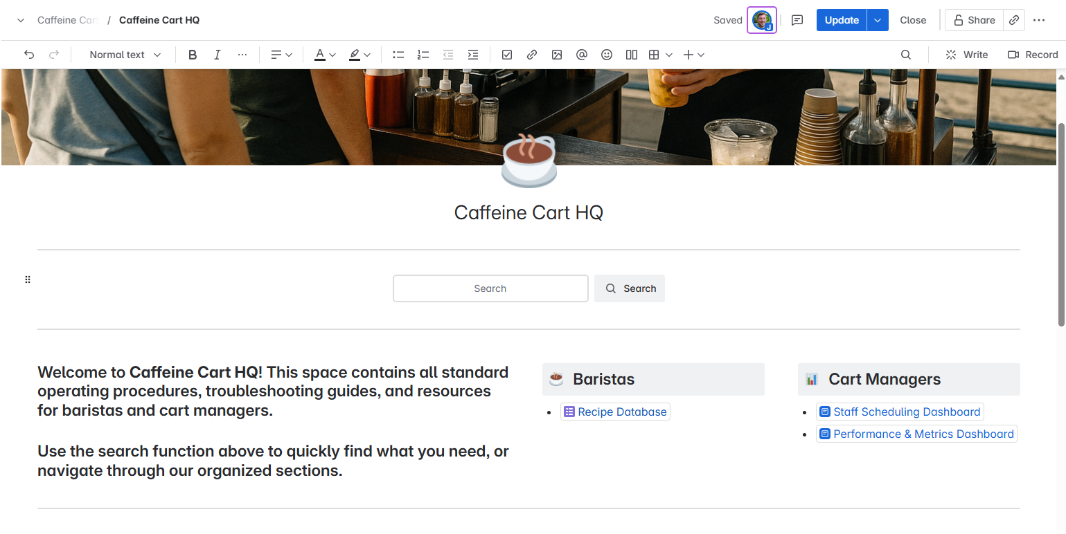
In this post, we’re going to be making a Confluence Space Homepage for a fictional coffee company, Caffeine Cart. The end result will look something like this:
Why It Matters
Confluence is a powerful tool for storing and sharing information, but its effectiveness relies on how well the content is organized and presented. An intuitive homepage acts as a gateway, allowing users to locate critical information without frustration. If your space is hard to navigate, it could go unused, undermining its purpose.
Know Your Users and Their Goals
Before you can start building, you need to clearly define who your audience is and what they are looking for. Consider the following questions:
- Who is the primary audience for this space? Are they end-users, developers, or both?
- What goals do they have when visiting this space? Are they looking for user guides, technical documentation, or something else?
If you have multiple user types, ensure your homepage is structured so that each audience can quickly identify the sections relevant to them. For instance, create separate areas for “End User Documentation” and “Technical Documentation.” Understanding your audience and their needs will help you group and organize content effectively.
Let’s assume we’re going to be setting this up for baristas and cart managers:
- Barista
- Goals: See the current seasonal menu and quickly find drink recipes.
- Cart Manager
- Goals: View Staff Scheduling Dashboard and view Performance/Metrics.
Map Your Page Tree
Once you understand your audience and their goals, it’s time to design your page tree. This structure will determine how your content is grouped and accessed. The page tree is located to the left of your space page and it’s always available for users to navigate.
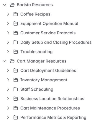
For Caffeine Cart, we will create a Barista Resources folder. We know that Barista’s need to find the coffee recipes, so we’ll create a Coffee Recipes folder for them. We also know there will be other useful content for them, so we’ll add that under their folder as well.
We’ll also create a Cart Manager Resources folder and we’ll add in the relevant content folders for them too. Here’s how we’re looking so far.
Keep in mind, if your space only serves content for one type of user, you can skip adding a folder for that user. Just start putting in folders for the different types of content they’ll need access to.
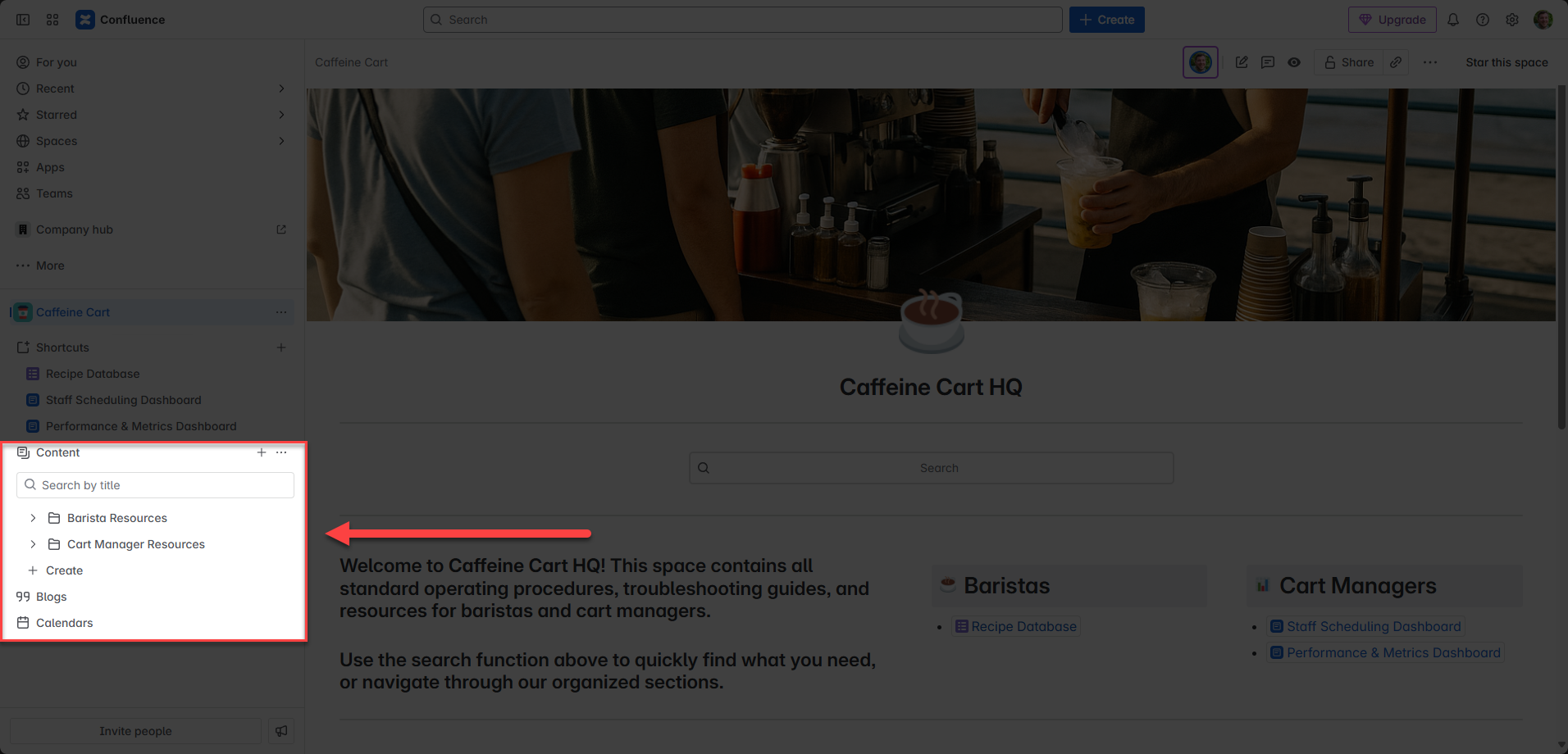
Leverage Space Shortcuts
Determine the most important pieces of information users are seeking and highlight them using Confluence’s Space Shortcuts feature.
These shortcuts, located in the sidebar, provide quick access to key resources. You don’t have to limit shortcuts to internal Confluence pages—you can link to external resources like your company website or other tools.
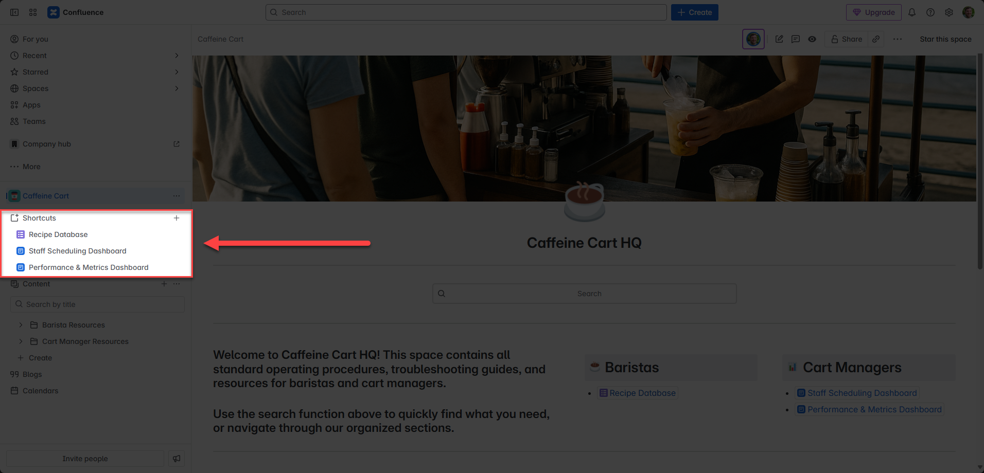
As you gather more data on how users interact with your space, you can adjust the shortcuts to reflect their most frequent needs. You can even reorder them so the most popular link is at the top.
Use Layouts and Headings to Chunk Content
A clean and visually appealing homepage is critical for user engagement. Avoid overwhelming your audience with walls of text. Instead, break content into bite-sized sections using layouts, headings, and Confluence macros.
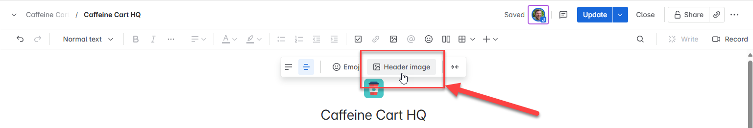
Step 1: Set the Header Image
Select a header image that helps convey what this space is about. Don’t just upload a photo to upload a photo.
For Caffeine Cart, we’ll use a photo of one of the baristas serving coffee to customers at the coffee cart.
On the home page of your space, press the keyboard shortcut e on your keyboard to open the page for editing. Alternatively, you can click the ‘Edit’ button at the top of the page.
Hover your mouse near the top of the page and you’ll see a menu appear. Click the Header Image button.
You can enter a search term to search free photos on Unsplash, but I’ve always found it better to use an image that you upload.
Next, you can add an emoji to the page for added fun. Obviously, I chose the coffee cup emoji. 😏 ..and here’s the finished selections:
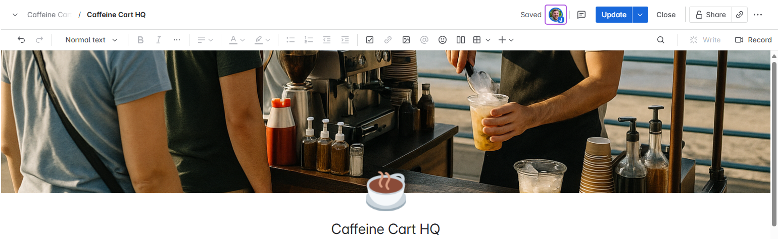
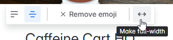
Now is also a really good time to make sure you can make use of the entire width of the screen. Hover over the top of the page and you’ll see a menu appear. Click the Page Width button and ensure it is set to Full Width.
Step 2: Create a Search Box
I love putting search boxes as the first thing on a space’s home page. Odds are, someone is looking for something and being able to easily search for it is a time saver for the user. But, before we drop in our first macro into our page, I like to throw a divider in.
I have noticed that content tends to hug really close to the homepage title, so to give it more visual spacing, I add in a divider.
add in a divider, type three dashes: --- and a divider will automatically appear.
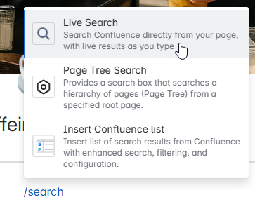
Next, type /search – Anytime you start with / , it tells Confluence you want to put a macro in the page. In this case, we’re going to select the Live Search option.
…and for good measure, lets put another divider after the search so we can create some visual symmetry.
Here’s how we should be looking now:

Step 3: Adding Columns
Ok, now we’re getting fancy. By default, you write on one big page in Confluence. You can create columns to help structure content, though. For this next section, we want to put important information, but we want to present it in columns so we can easily see it without scrolling down the page.
Start by typing /column and select 3 Column Layout
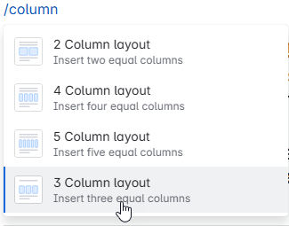
Now, you can select whatever layout you want after this, but for my page I’m designing, I’m going to select the 3rd option which has one big column, and two smaller columns:
Step 4: Add the Goal of the Space
In the big column, we’re going to put a quick introduction/goal of what this space is for. To do this, we’ll use Heading 2 so the text is bigger and more visually appealing. You can quickly insert Heading 2 text by type ## and then a space; Confluence will automatically convert the text line into a Heading 2.
Now, however you want to describe your space is up to you, but I do always like to include line about using the search function or navigating the organized pages. Something like this:
Use the search function above to quickly find what you need, or navigate through our organized sections.
Here’s where you should be at now:

Step 5: Create Fancy Section Titles
Now, remember how we had identified what the main goals are of the audience viewing the space? We’re going to make it super simple for them to find what they need by linking out to the content that is most helpful to them.
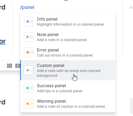
To do this, we’re going to make use of a macro in a non-conventional way. I like to use custom panel macros, which typically are used to put information in a callout box. But, we’re going to use them for section titles!
In the middle column, lets work on the Barista content. Type /panel and select the Custom panel.
Use a Heading 2 and type Baristas. Then, set the background color to gray:
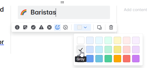
Next, we’re going to set the icon to something appropriate for that audience. I’ll select the coffee cup emoji:
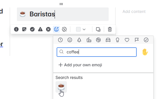
Now we have a fancy heading for our Barista’s section.
Step 6: Create a List of Linked Pages
Now we want to list out the most helpful destinations for the baristas and we’ll do this by providing a list of links. We can very quickly create a list by typing * and then space. Confluence will automatically create a bulleted list item.
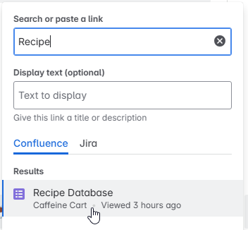
Now, lets link out to a Recipe Database. This is an existing database I’ve created in this space. To link to it, type /link and a search screen will appear where you can search for the content you want to link to.
Confluence likes to put a fancy preview link in. We can make it more simple so it can be used in the list by clicking on the link and selecting the “inline” option.
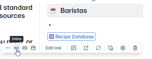
Just go back up to your bulleted list item and press the Delete key. It will bring your link back up as the bulleted item.
Now all that is left to do is to repeat step 5 + 6 for the Cart Managers audience.
Once you have all of the columns populated with helpful information, insert a divider. Here’s how you should be looking overall:
Lookin’ pretty good, huh?
Step 7: More Columns!
Everything that we’ve done so far is “above the fold” – meaning you don’t have to scroll to see it. We’re going to now add more columns to put some helpful information, but it’s not AS important.
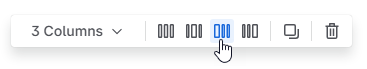
Go ahead and add 3 columns again. This time, we’ll accept the default 3 columns where they’re all equal in width.
In the first column, create a fancy section title (like we did in Step 5) for Recent Updates.
In the second column, create a fancy section title for Seasonal Coffee.
In the third column, create a fancy section title for Seasonal Tea.
Here’s how you should look now:

Step 8: Add a Recent Updates Macro
The recent updates macro lets you show some recent happenings in the space. It dynamically updates as more things happen in the space. It’s a good way to show people some of the freshest content available in the space.
In the first column, under the fancy section title, type /recent and select Recent updates.
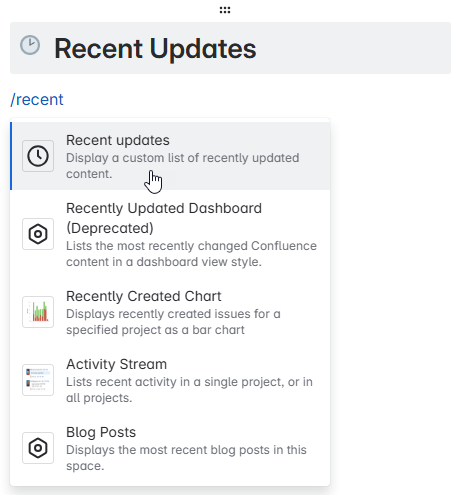
The macro will be inserted and the options for the macro will display in the right sidebar. Here are the settings I like to use:
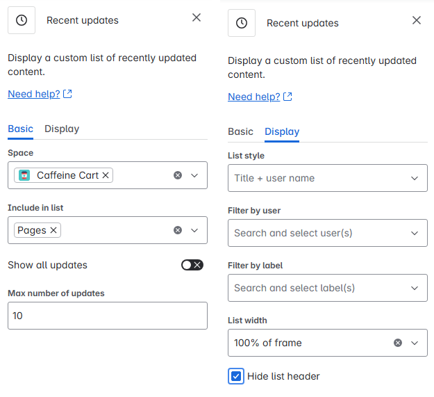
Using these settings, you should see something like this:

Step 9: Creating Tables
Next, we’re going to show some pictures for the seasonal coffee and tea. Remember, we’re going for helpful information that can be glanced at and you immediately comprehend what is going on. We could just create a list of the seasonal offerings, but a picture is more quickly digested and understood.
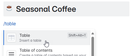
Under the Seasonal Coffee fancy section title, type /table and select Table.
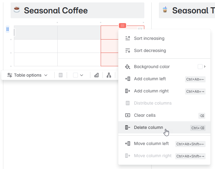
A default table will be inserted. We want a 2×2 Table (2 Columns, 2 Rows). So highlight the last column and selectDelete Column:
Now, do the same for the 3rd row:
Now we have a 2×2 table. We just need to turn the “Header Row” off – that would be the light gray row. To do this, select Table options and then uncheck the Header row option.
Step 10: Inserting Images
Now, to make it easy for the barista’s, we’re going to put 4 pictures of our seasonal coffee offerings. To do this, go to the first table cell and type /image and select Image, video, or file.
Click the Upload button and select a photo to upload from your computer.
The photo will be inserted into the table. Under the photo, you’ll have an option to add a caption if you want to.
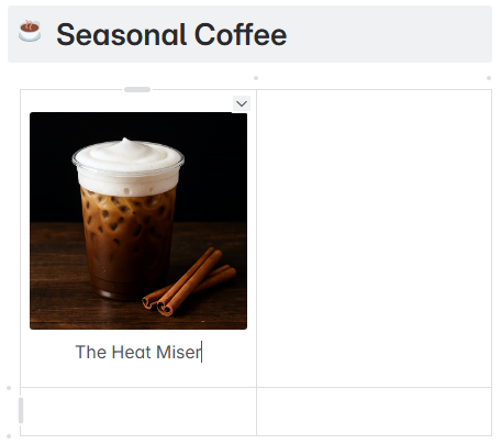
Repeat this step for the remaining 3 cells in the table.
Repeat steps 9 and 10 for the Seasonal Tea.
Great Homepage Examples
I don’t have any examples of great home pages in the wild! Do you think you have a great home page? Send it into me and I may feature it on this page.
Final Thoughts
An intuitive Confluence homepage can make the difference between a space that is actively used and one that is overlooked. By understanding your users, organizing your content effectively, and presenting it in a clear and engaging way, you can create a homepage that serves as a valuable resource for your audience. I’m all for making a space that wants to be used to cut down on the instant messages and e-mails asking where someone can find a particular piece of information. 😉Give these tips a try and see how much easier it becomes for your team to access and use the information they need. Let me know how it goes in the comments!
Josh Martin
Content Creator
Creating a well-structured and intuitive homepage for your Confluence space is essential for ensuring your audience can quickly and easily find the information they need. A cluttered or disorganized space can deter users and reduce the effectiveness of your content. Even worse, a wall of text page will send them clicking close on their tab in a heartbeat. In this post, we’ll walk you through the steps to build a homepage that makes navigating your Confluence space a breeze.
In this post, we’re going to be making a Confluence Space Homepage for a fictional coffee company, Caffeine Cart. The end result will look something like this:
Why It Matters
Confluence is a powerful tool for storing and sharing information, but its effectiveness relies on how well the content is organized and presented. An intuitive homepage acts as a gateway, allowing users to locate critical information without frustration. If your space is hard to navigate, it could go unused, undermining its purpose.
Know Your Users and Their Goals
Before you can start building, you need to clearly define who your audience is and what they are looking for. Consider the following questions:
- Who is the primary audience for this space? Are they end-users, developers, or both?
- What goals do they have when visiting this space? Are they looking for user guides, technical documentation, or something else?
If you have multiple user types, ensure your homepage is structured so that each audience can quickly identify the sections relevant to them. For instance, create separate areas for “End User Documentation” and “Technical Documentation.” Understanding your audience and their needs will help you group and organize content effectively.
Let’s assume we’re going to be setting this up for baristas and cart managers:
- Barista
- Goals: See the current seasonal menu and quickly find drink recipes.
- Cart Manager
- Goals: View Staff Scheduling Dashboard and view Performance/Metrics.
Map Your Page Tree
Once you understand your audience and their goals, it’s time to design your page tree. This structure will determine how your content is grouped and accessed. The page tree is located to the left of your space page and it’s always available for users to navigate.
For Caffeine Cart, we will create a Barista Resources folder. We know that Barista’s need to find the coffee recipes, so we’ll create a Coffee Recipes folder for them. We also know there will be other useful content for them, so we’ll add that under their folder as well.
We’ll also create a Cart Manager Resources folder and we’ll add in the relevant content folders for them too. Here’s how we’re looking so far.
Keep in mind, if your space only serves content for one type of user, you can skip adding a folder for that user. Just start putting in folders for the different types of content they’ll need access to.
Leverage Space Shortcuts
Determine the most important pieces of information users are seeking and highlight them using Confluence’s Space Shortcuts feature.
These shortcuts, located in the sidebar, provide quick access to key resources. You don’t have to limit shortcuts to internal Confluence pages—you can link to external resources like your company website or other tools.
As you gather more data on how users interact with your space, you can adjust the shortcuts to reflect their most frequent needs. You can even reorder them so the most popular link is at the top.
Use Layouts and Headings to Chunk Content
A clean and visually appealing homepage is critical for user engagement. Avoid overwhelming your audience with walls of text. Instead, break content into bite-sized sections using layouts, headings, and Confluence macros.
Step 1: Set the Header Image
Select a header image that helps convey what this space is about. Don’t just upload a photo to upload a photo.
For Caffeine Cart, we’ll use a photo of one of the baristas serving coffee to customers at the coffee cart.
On the home page of your space, press the keyboard shortcut e on your keyboard to open the page for editing. Alternatively, you can click the ‘Edit’ button at the top of the page.
Hover your mouse near the top of the page and you’ll see a menu appear. Click the Header Image button.
You can enter a search term to search free photos on Unsplash, but I’ve always found it better to use an image that you upload.
Next, you can add an emoji to the page for added fun. Obviously, I chose the coffee cup emoji. 😏 ..and here’s the finished selections:
Now is also a really good time to make sure you can make use of the entire width of the screen. Hover over the top of the page and you’ll see a menu appear. Click the Page Width button and ensure it is set to Full Width.
Step 2: Create a Search Box
I love putting search boxes as the first thing on a space’s home page. Odds are, someone is looking for something and being able to easily search for it is a time saver for the user. But, before we drop in our first macro into our page, I like to throw a divider in.
I have noticed that content tends to hug really close to the homepage title, so to give it more visual spacing, I add in a divider.
add in a divider, type three dashes: --- and a divider will automatically appear.
Next, type /search – Anytime you start with / , it tells Confluence you want to put a macro in the page. In this case, we’re going to select the Live Search option.
…and for good measure, lets put another divider after the search so we can create some visual symmetry.
Here’s how we should be looking now:
Step 3: Adding Columns
Ok, now we’re getting fancy. By default, you write on one big page in Confluence. You can create columns to help structure content, though. For this next section, we want to put important information, but we want to present it in columns so we can easily see it without scrolling down the page.
Start by typing /column and select 3 Column Layout
Now, you can select whatever layout you want after this, but for my page I’m designing, I’m going to select the 3rd option which has one big column, and two smaller columns:
Step 4: Add the Goal of the Space
In the big column, we’re going to put a quick introduction/goal of what this space is for. To do this, we’ll use Heading 2 so the text is bigger and more visually appealing. You can quickly insert Heading 2 text by type ## and then a space; Confluence will automatically convert the text line into a Heading 2.
Now, however you want to describe your space is up to you, but I do always like to include line about using the search function or navigating the organized pages. Something like this:
Use the search function above to quickly find what you need, or navigate through our organized sections.
Here’s where you should be at now:
Step 5: Create Fancy Section Titles
Now, remember how we had identified what the main goals are of the audience viewing the space? We’re going to make it super simple for them to find what they need by linking out to the content that is most helpful to them.
To do this, we’re going to make use of a macro in a non-conventional way. I like to use custom panel macros, which typically are used to put information in a callout box. But, we’re going to use them for section titles!
In the middle column, lets work on the Barista content. Type /panel and select the Custom panel.
Use a Heading 2 and type Baristas. Then, set the background color to gray:
Next, we’re going to set the icon to something appropriate for that audience. I’ll select the coffee cup emoji:
Now we have a fancy heading for our Barista’s section.
Step 6: Create a List of Linked Pages
Now we want to list out the most helpful destinations for the baristas and we’ll do this by providing a list of links. We can very quickly create a list by typing * and then space. Confluence will automatically create a bulleted list item.
Now, lets link out to a Recipe Database. This is an existing database I’ve created in this space. To link to it, type /link and a search screen will appear where you can search for the content you want to link to.
Confluence likes to put a fancy preview link in. We can make it more simple so it can be used in the list by clicking on the link and selecting the “inline” option.
Just go back up to your bulleted list item and press the Delete key. It will bring your link back up as the bulleted item.
Now all that is left to do is to repeat step 5 + 6 for the Cart Managers audience.
Once you have all of the columns populated with helpful information, insert a divider. Here’s how you should be looking overall:
Lookin’ pretty good, huh?
Step 7: More Columns!
Everything that we’ve done so far is “above the fold” – meaning you don’t have to scroll to see it. We’re going to now add more columns to put some helpful information, but it’s not AS important.
Go ahead and add 3 columns again. This time, we’ll accept the default 3 columns where they’re all equal in width.
In the first column, create a fancy section title (like we did in Step 5) for Recent Updates.
In the second column, create a fancy section title for Seasonal Coffee.
In the third column, create a fancy section title for Seasonal Tea.
Here’s how you should look now:
Step 8: Add a Recent Updates Macro
The recent updates macro lets you show some recent happenings in the space. It dynamically updates as more things happen in the space. It’s a good way to show people some of the freshest content available in the space.
In the first column, under the fancy section title, type /recent and select Recent updates.
The macro will be inserted and the options for the macro will display in the right sidebar. Here are the settings I like to use:
Using these settings, you should see something like this:
Step 9: Creating Tables
Next, we’re going to show some pictures for the seasonal coffee and tea. Remember, we’re going for helpful information that can be glanced at and you immediately comprehend what is going on. We could just create a list of the seasonal offerings, but a picture is more quickly digested and understood.
Under the Seasonal Coffee fancy section title, type /table and select Table.
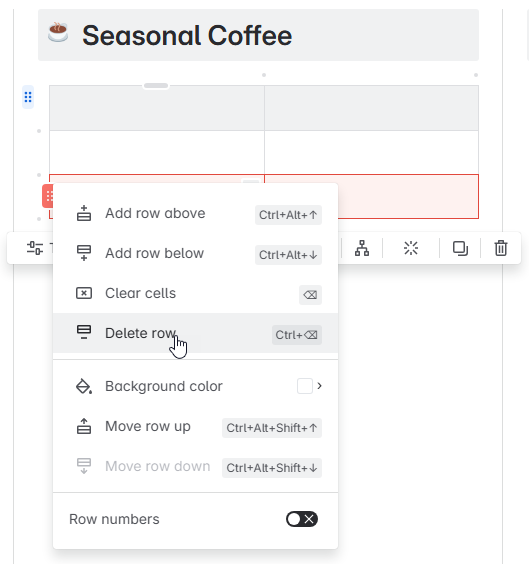
A default table will be inserted. We want a 2×2 Table (2 Columns, 2 Rows). So highlight the last column and selectDelete Column:
Now, do the same for the 3rd row:
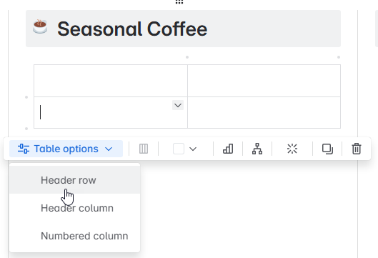
Now we have a 2×2 table. We just need to turn the “Header Row” off – that would be the light gray row. To do this, select Table options and then uncheck the Header row option.
Step 10: Inserting Images
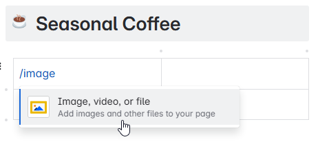
Now, to make it easy for the barista’s, we’re going to put 4 pictures of our seasonal coffee offerings. To do this, go to the first table cell and type /image and select Image, video, or file.
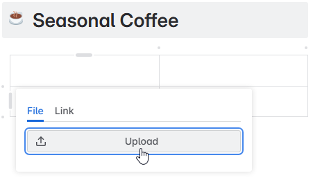
Click the Upload button and select a photo to upload from your computer.
The photo will be inserted into the table. Under the photo, you’ll have an option to add a caption if you want to.
Repeat this step for the remaining 3 cells in the table.
Repeat steps 9 and 10 for the Seasonal Tea.
Great Homepage Examples
I don’t have any examples of great home pages in the wild! Do you think you have a great home page? Send it into me and I may feature it on this page.
Final Thoughts
An intuitive Confluence homepage can make the difference between a space that is actively used and one that is overlooked. By understanding your users, organizing your content effectively, and presenting it in a clear and engaging way, you can create a homepage that serves as a valuable resource for your audience. I’m all for making a space that wants to be used to cut down on the instant messages and e-mails asking where someone can find a particular piece of information. 😉Give these tips a try and see how much easier it becomes for your team to access and use the information they need. Let me know how it goes in the comments!


[…] Want a step-by-step walkthrough with visuals? Here’s a full guide on how to build a homepage your team will actually use. […]
[…] a full deep dive on building a space homepage that actually helps people, I wrote an entire guide: How to Build an Intuitive Confluence Space Homepage. But for the quarterly review, just focus on making sure it doesn’t send people in the wrong […]
[…] Make it easy to find later – start with an intuitive space homepage so docs don’t get buried: How to Build an Intuitive Confluence Space Homepage […]